首頁 > 得獎作品 > 美國 TITAN 金獎
文章分類Article
得獎作品設計 印象五零
印象五零Yinxiang Wuling
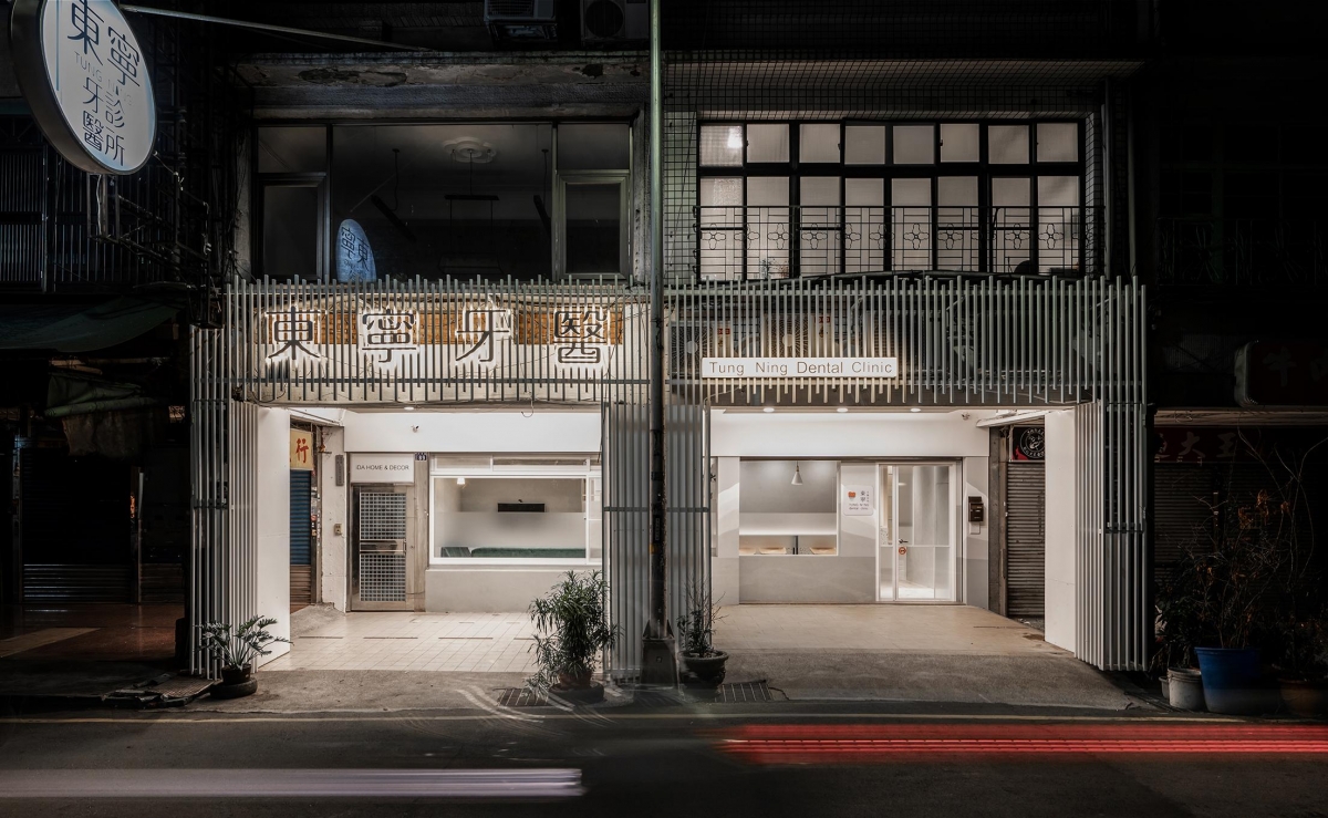

本案為傳統街屋一樓雙戶併改造而成的牙醫診所,合計室內面積約135平方米,原建築結構的超長縱深、屋高不足、自然採光受限;以及未來作為專業醫療診間不可或缺的水路、管線、器械配置、人員動線等,都是力求慎重且全面的規劃重點。
This case is a traditional building in a street with two units on the first floor merged and converted into a dental clinic. With a total interior area of about 135 square meters, the original building structure has a long depth and a lack of height, resulting in limited natural lighting. In addition, the focus of careful and comprehensive planning includes the waterway, piping, equipment configuration, staff movement, etc., which are indispensable for a medical clinic to be professional in the future.

有鑒於基地周邊為知名文化街區,為呼應街景與在地人文歷史,店面騎樓外觀以白鋁格柵搭配背光店招輕量修飾,外牆處除了擴大開窗面積,牆面也以分段山形灰漸層塗裝,營造雅正文青底蘊。
In view of the fact that the base is surrounded by a well-known cultural district and in order to echo the streetscape and local culture and history, the exterior of the store is decorated with white aluminum grilles and backlit store signs. The exterior wall is not only paired with an enlarged window but is also painted in gradual layers of segmented mountain-shaped gray to an intelligentsia vibe.
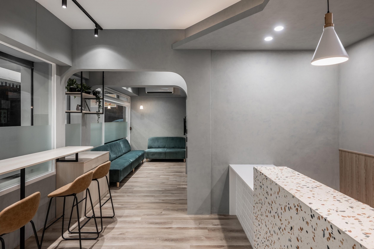
室內機能單元分配大致以分戶牆為界,逐區規劃接待櫃檯、等候區、X光室與多間獨立診室,空間視覺除了延續低調、現代的灰階美學,多處工藝細節以及風格語彙應用,皆深度體現男、女主人個別對於日系簡約、懷舊復古的浪漫偏好,例如入口接待櫃檯以水磨石砌作,鏡頭從窗前高腳吧、方圓門拱帶到另一側的絲絨沙發等候區,整體流露時下摩登咖啡館般的悠閒氣息,無形中也創造和諧輕鬆醫患關係。
The allocation of functional units inside is roughly defined by the subdivision wall, with a reception counter, a waiting area, an X-ray room and independent doctors offices planned on a zone-by-zone basis. In addition to continuing the understated, modern grayscale aesthetic, the visual space features many details of craftsmanship and the use of a stylish vocabulary, all of which deeply reflect the male and female owners individual romantic preference for Japanese simplicity and nostalgic retro. For example, the reception counter at the entrance is made of terrazzo and as the camera leads from the high bar in front of the window and the square arch to the velvet sofa in the waiting area on the other side, a relaxed atmosphere similar to that of a modern cafe is revealed, which also creates a harmonious and relaxed doctor-patient relationship.
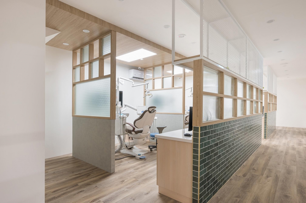
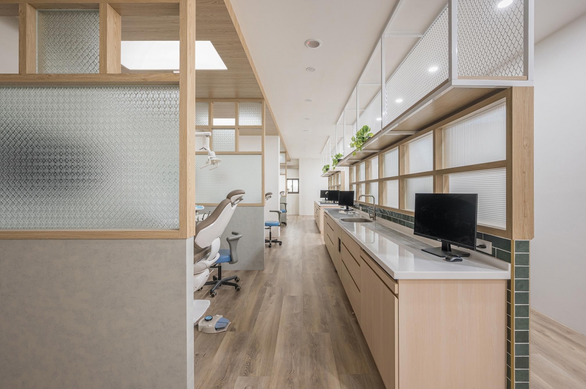
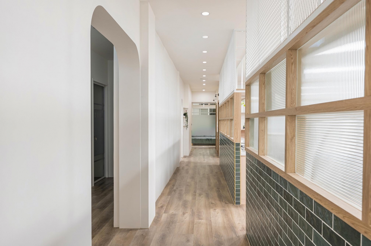
此外,沿著中央走道對列的獨立診室群,大量採用白色金屬網格、灰色半牆、墨綠鐵道磚、木結構鑲嵌復古花玻等元素,打造光影全時半穿透的場域介質,大幅改善長屋採光受限疑慮,整體宛如自時光隧道緩緩走來的昭和風韻,成就身處繁忙都會中,足以讓人片刻慢下腳步的印象五零。
In addition, the independent doctors offices along the two sides of the central aisle are adorned with white metal grids, gray half walls, dark green railroad tiles and wooden structures with vintage patterned glass inlays to a full-time semi-translucent media of light and shadow in the space, which greatly improves the lighting limitations of the elongated house. Overall, it makes you feel as if you have gone back in time to experience the charm of Showa, which creates an impression that can slow people down for a moment in a busy city.
完整室內設計作品 TITAN Design Awards 得獎連結/電子證書